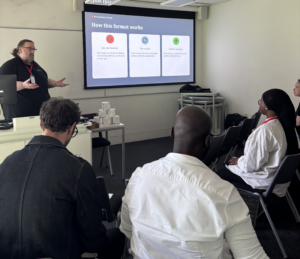
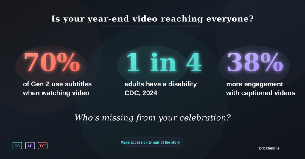
The Irony of 'Best Of' Videos: Celebrating the Year While Excluding Your Audience

As December rolls around, social media feeds fill with slickly produced ‘year in review’ videos. Companies showcase their achievements, milestones, and memorable moments through dynamic montages set to upbeat music. These videos are designed to inspire, connect, and celebrate.
But here’s the uncomfortable truth: many of these celebratory videos actively exclude significant portions of the very audiences they’re trying to reach.
Not through malice, but through design choices that create barriers. And once you recognise those barriers, you can’t unsee them.
What These Videos Do Really Well
![Dark-themed graphic depicting a video player interface against a deep blue background. The player shows a faded year-end celebration video with confetti and blurred animated text. Three accessibility barriers are prominently displayed: a coral-coloured muted speaker icon with an X on the left, a caption bar reading "[Auto-captions: unintelligible]" at the bottom of the video, and a purple "AD" audio description icon crossed out on the right. Motion blur on text indicates it disappears in 2 seconds. The title "The Irony of Best Of Videos" appears at the top in white serif font, with the subtitle "Celebrating the year while excluding your audience" at the bottom.](https://brickfield.ie/wp-content/uploads/2025/12/linkedin-header-option2-muted-message-1024x535.png)
What These Videos Do Really Well
Before discussing what goes wrong, it’s worth acknowledging what makes these productions so appealing. The best year-end videos combine several elements effectively:
- Fast-paced, visually rich storytelling with animations, workplace footage, customer moments, and polished graphics edited to create momentum and emotional impact.
- Kinetic typography has become standard practice in corporate motion design, with short punchy lines of text that slide, pop, rotate, and transform across the screen.
- Music-driven rhythm that sets the emotional tone and pacing, particularly important since most organisations don’t use narration.
- Genuine highlights including product launches, customer wins, impact statistics, community initiatives, staff celebrations, and awards.
- Emotional resonance that leaves viewers feeling inspired, proud, or connected.
All of this is genuinely impressive work. But these same design choices, left unsupported, create significant accessibility barriers.
The Barriers Hidden in Plain Sight
For everyone watching without sound
For people who are blind or have low vision
The reliance on animated text with no spoken narration means screen reader users receive nothing meaningful from the video. It might as well be silent abstract art.
- Text that appears briefly cannot be resized, paused, or adjusted.
- Screen magnifiers often distort animated content, making it even harder to follow.
- When visuals carry meaning, such as footage of employees volunteering or a new product being unveiled, that story goes completely untold without audio description or a text version.
- Someone blind watching a video showing the organisations team making a difference in the community, will never know that’s what happened unless someone describes it.
For people with cognitive or learning differences
Text that appears and disappears in under two seconds cannot be processed at an individual’s own pace.
- Rapid transitions and simultaneous visual elements create cognitive overload.
- There’s no way to pause and absorb information meaningfully.
- For many neurodivergent viewers, the constant motion and visual complexity makes the content exhausting rather than engaging.
For people with vestibular or photosensitive conditions
- Rapid flashing, strobing effects, and quick cuts can trigger seizures, migraines, or vestibular symptoms like dizziness and nausea.
- Constant motion that looks dynamic to some viewers feels physically unpleasant to others.
Making It Accessible Without Killing the Creativity
The solutions aren’t complicated, expensive, or creativity-limiting. They just require consideration.
Provide a full text alternative
Publish an accompanying blog post or article containing everything shown on screen:
- The text content.
- Descriptions of key visuals.
- Names and statistics.
- Any messages that appear too quickly to read.
This single step solves many accessibility issues and dramatically improves your SEO. It also gives you a resource with lasting value that you can reference and share throughout the following year.
Add narration that covers all key points
Narration doesn’t need to replace your beautiful visuals and text animations. It just needs to express the same meaning through audio. Instead of text that flashes ‘A year of growth,’ have someone say it.
This benefits:
- Blind and low-vision users.
- Auditory learners.
- Anyone watching while doing something else.
Create an audio described version
This doesn’t need to be complex. Even a simple extended description track makes an enormous difference. Something like ‘Clips of our Dublin team volunteering at a community centre, packing care boxes and distributing them to families’ takes seconds to record but makes the content meaningful to people who can’t see it.
Caption the video properly
Auto-captions are a starting point, not a solution. Human-edit them to ensure:
- Correct wording.
- Accurate timing.
- Proper punctuation.
- Correct names and terminology.
- Meaningful sound cues.
This one step dramatically improves accessibility for deaf and hard of hearing viewers and. all who dont use audio at all. Research shows that videos with captions experience 38% more engagement and retain viewers 31% longer.
Reduce unnecessary motion
You don’t need to eliminate animation entirely. Just ensure:
- Text stays on screen long enough to be read.
- Motion serves a purpose rather than being purely decorative.
- Contrast remains high throughout.
- Typography stays legible even when moving.
Beautiful design and functional accessibility can absolutely coexist.
Check for flashing content
Use available tools to verify you’re not exceeding three flashes per second, which is the threshold that can trigger photosensitive seizures.
The Bigger Picture
These videos often highlight organisational culture, community impact, employee achievements, and company values. They’re meant to be inclusive celebrations, a way of saying ‘look what we achieved together.’
But when accessibility is missing, the message becomes unintentionally contradictory: we celebrate everyone, except the people who can’t access this video.
The customers, employees, and partners who helped make those achievements possible may not be able to experience the recap at all. That’s not just a missed opportunity. It’s a contradiction of the very values these videos are meant to represent.
Creating accessible content isn’t a compliance checkbox. It’s a reflection of whether inclusion is something you talk about or something you actually practise.
Final Thoughts
Year-end recap videos are a fantastic way to reflect on achievements and inspire audiences for the year ahead. They’re creative, engaging, and emotionally resonant when done well.
They shouldn’t exclude the people who helped make those achievements possible.
With a few thoughtful choices, any organisation can produce a year-end video that’s accessible, inclusive, creative, and impactful, available to everyone who wants to celebrate with you.
That’s something genuinely worth celebrating.