When Captions Become Decoration: Why Animated Text Overlays Are an Accessibility Problem
You’ve probably noticed it already. Open any social media platform right now — TikTok, Instagram Reels, YouTube Shorts, LinkedIn — and you’ll see words bouncing, zooming, and flying across videos in time with the speaker. Big, bold, animated text. It looks dynamic. It grabs attention. And it’s everywhere.
But here’s the thing. Those animated words aren’t captions. They look like captions. They feel like captions. But they don’t function like captions. And that distinction matters more than most people realise.
Table of Contents
Let's Start at the Beginning
To understand why this matters, you need to understand what’s actually happening technically. There are two fundamentally different ways to put text on a video.
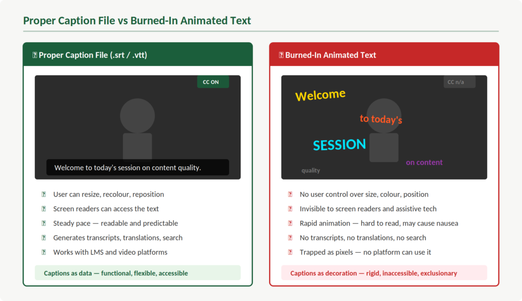
The first is a caption file. This is a separate file — typically an .srt or .vtt format — that contains the text, the timing, and sometimes positioning information. It sits alongside the video. Your media player reads it and displays the text. And this is key: because it’s a separate file, the viewer has control over it. You can turn it on or off. You can resize it. You can change the colours. Your assistive technology can read it.
The second approach is what’s now trending. Creators are “burning” animated text directly into the video image itself. The words are rendered as pixels, baked into every frame, often using tools like CapCut or Descript. They pop, bounce, change colour, and disappear at speed. They’re part of the video in the same way the background or the speaker’s face is part of the video.
So what does that mean in practice? It means the text is no longer data. It’s decoration. And that’s a fundamental problem.
The Control That Disappears
Think about someone who relies on captions to access spoken content. Maybe they’re Deaf or hard of hearing. Maybe they’re in a noisy environment. Maybe they process information more effectively when they can read along.
With a proper caption file, that person has options. They can adjust the font size to suit their vision. They can change the background contrast so the text is readable against any video content. They can pause and reread. They can let their screen reader access the text. The platform handles all of this because the caption data is there for it to work with.
Now take all of that away. That’s what burned-in animated text does.
What you see is what you get. If the font is too small, you can’t change it. If the colour blends into the background of a particular scene, you’re stuck. If the words animate on and off screen faster than you can read them, there’s nothing you can do about it.
This isn’t a minor usability issue. This is about whether someone can access your content at all.
Speed, Readability, and Who Gets Left Behind
Let’s break this down further. Standard caption guidelines exist for good reason. They specify reading speeds, display durations, and positioning — all designed to ensure that people have enough time to read and process the text.
Animated text overlays ignore all of this. The words are typically timed to the speaker’s natural rhythm, which means they appear and vanish in fractions of a second. For someone scrolling through a feed, that creates a dynamic, attention-grabbing effect.
For someone who needs captions to understand the content? It creates a barrier.
People who are Deaf or hard of hearing are reading those words as their primary channel for the information. They need adequate time. People with cognitive disabilities or processing differences need that time too. When words are flying across the screen with animations, colour shifts, and rapid transitions, the content becomes genuinely difficult to follow.
And this is really important — it isn’t that these viewers are struggling because the content is complex. They’re struggling because the presentation is working against them. The information might be perfectly straightforward. The delivery is the problem.
What Assistive Technology Can't See
Here’s where it gets more serious. A proper caption file is machine-readable. Screen readers can access it. Assistive software can interpret it. It exists as structured data that technology can work with.
Burned-in text is none of these things. It’s pixels. As far as assistive technology is concerned, those animated words simply don’t exist. A screen reader cannot detect them. A braille display cannot render them. Any tool that relies on caption data to provide access to video content will find nothing there.
Some people who are blind or have low vision use screen readers alongside caption tracks to access video content. When there’s no caption file — just animated text burned into the video image — that pathway isn’t broken. It’s absent. There’s nothing there for the technology to work with.
This is about content quality. If your content can’t be reached by the technology people depend on, it isn’t accessible. Full stop.
The Sensory Overload Problem
There’s another dimension to this that doesn’t get enough attention. Kinetic typography — text that moves, bounces, scales, rotates, and changes colour — is stimulating by design. That’s the whole point of it. Grab attention. Keep eyes on the screen.
But for many people, that stimulation is the opposite of helpful. People with vestibular disorders can experience dizziness or nausea from rapid on-screen motion. People with photosensitive conditions may be affected by flashing or rapid colour changes. People with ADHD or autism may find the constant visual movement makes it harder to focus on the actual message.
Standard captions are deliberately predictable. They appear in a consistent position, in a consistent style, at a readable pace. That predictability is a feature. It’s what allows people to rely on them comfortably, session after session, video after video.
The important thing is this: when you replace that predictability with animation, you’re not enhancing the experience for people who need captions. You’re degrading it.
Everything Else You Lose
Beyond the immediate viewing experience, proper caption files unlock an entire ecosystem of functionality. Transcripts. Searchable text. Automatic translations. SEO value. The ability to repurpose content across platforms and formats. Content indexing for archives and learning management systems.
All of this comes from captions being data rather than pixels.
When your captions are burned into the video, they’re trapped. You can’t extract them. You can’t translate them into another language. You can’t generate a transcript for a student who needs one. You can’t search them. You’ve taken flexible, functional, machine-readable information and turned it into a static image.
For anyone working in education or training, that should give you pause. Captions as data serve your learners in dozens of ways beyond the video itself. Captions as pixels serve one purpose: looking good on screen.
This Isn't Either/Or
Now, I want to be fair here. It isn’t that people who use animated text overlays don’t care about accessibility. They generally don’t know. They see words on screen and assume the job is done. The accessibility box feels ticked.
But it isn’t. Not even close.
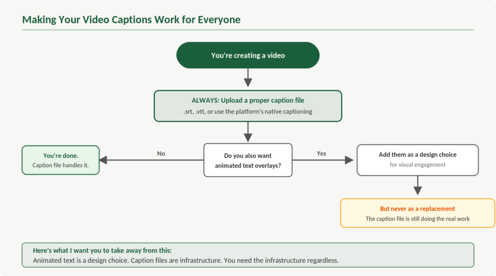
And here’s what I want you to take away from this: you don’t have to choose between visual appeal and accessibility. You can use animated text overlays for aesthetic purposes and still upload a proper caption file alongside the video. Most platforms support both. The animated text does its job for engagement. The caption track does its job for access. Everyone benefits.
The problem only arises when animated text replaces proper captions rather than complementing them. That’s the shift we need to see — from treating animated text as a caption substitute to treating it as what it actually is: a design choice.
The Bigger Picture
This trend is really a symptom of something we see across digital content. Accessibility features get adopted for mainstream appeal, but in the process, their functional purpose gets lost. Captions become a visual trend. Alt text becomes an SEO tactic. Colour contrast becomes a branding discussion. The people these features were designed to serve get pushed to the margins.
This is about content quality. It’s about recognising that the functional purpose of an accessibility feature should never be sacrificed for aesthetics. You can have both — but only if you do the work to make both happen.
So the next time you’re creating a video, by all means make it visually engaging. Use the animated text if it serves your content. But upload that caption file too. Make sure the captions are accurate, properly timed, and available as data that your viewers and their technology can actually use.
Because captions were never meant to be decoration. They’re infrastructure. And infrastructure needs to work for everyone.