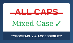
Why ALL CAPS Text Creates Reading Barriers
The research is clear: capitalising text doesn’t help readers — it hinders them
Picture yourself reading a paragraph of text. Your eyes move across the page, recognising words as shapes. You don’t read letter-by-letter — you read whole words at a glance.
Now imagine that process being disrupted. That’s exactly what happens with ALL CAPS.
We’ve been using capital letters to emphasise important content for decades. Lawyers do it in contracts. Designers do it in headings. Course creators do it to highlight key terms. But the research tells us something uncomfortable — it doesn’t work. In fact, it makes things worse.
Table of Contents
The Speed Problem
Miles Tinker’s landmark research from 1955 established this clearly: reading speed drops by 10-20% when text is in all capitals. A 2019 study confirmed this holds true today — lowercase text is read more than 13% faster across all grade levels.
So why does this happen?
The Shape of Words
When you read mixed-case text, words have distinctive shapes. Letters like b, d, h, and l reach upward. Letters like g, p, q, and y drop below the line. This creates a unique silhouette for each word — and experienced readers recognise these shapes instantly.
Here’s the difference:
Distinctive ascending and descending shapes
Uniform rectangles — no distinctive features
With ALL CAPS, every word becomes a rectangle. The distinctive shapes disappear. Your brain can’t recognise the word by its shape anymore, so it has to process each letter individually. That’s slower. Much slower.
The Screen Reader Problem
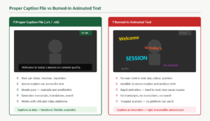
Here’s something you might not have considered. Screen readers — the software that converts text to audio for blind and low-vision users — may interpret ALL CAPS as acronyms and spell words letter-by-letter.
Screen reader output comparison
Source text: HE SAT TO REMOVE THE ASP FROM THE KIT BAG
Possible output: “HE-S-A-T-TO-REMOVE-THE-A-S-P-FROM-THE-K-I-T-BAG.”
Source text: He sat to remove the asp from the kit bag
Expected output: “He sat to remove the asp from the kit bag”
Testing by accessibility researcher Terrill Thompson found that VoiceOver “always spells out ACADEMICS if it appears visually in all caps” — even when CSS styling is applied. Imagine trying to understand a legal document when every capitalised word is spelled out letter by letter.
Who's Affected Most?
While ALL CAPS affects everyone, some groups face even greater challenges.
People with dyslexia rely heavily on word shapes for recognition. Research shows dyslexic readers slow down by 13-18% more than typical readers when encountering all-caps text. The British Dyslexia Association explicitly recommends against uppercase for continuous text.
Older adults face particular difficulties. A groundbreaking 2020 study in the Journal of Empirical Legal Studies examined ALL CAPS in contracts and found that participants over 55 were 29% more likely to misunderstand contract terms when presented in capitals.
Even Courts Have Noticed
The legal profession has long relied on ALL CAPS to make terms “conspicuous.” But the evidence is catching up with practice.
“Lawyers who think their caps lock keys are instant ‘make conspicuous’ buttons are deluded. In determining whether a term is conspicuous, we look at more than formatting.” — 2002 U.S. Court Ruling
The 2020 Arbel and Toler study went further, concluding: “We believe that there is a compelling reason to abolish judicial reliance on all-caps. Courts should stop giving any weight to the use of all-caps in contracts.”
The Bottom Line
Over a century of research points in one direction: ALL CAPS makes text harder to read, not easier. It slows everyone down, creates barriers for people with disabilities, and can cause screen readers to spell out words letter-by-letter.
The solution is simple. Use sentence case for body text. If you need visual capitalisation, use CSS. For emphasis, use bold — it actually works.
Typography isn’t decoration — it’s infrastructure for thought. Every design decision either supports the reader or creates barriers. Choose to support them.
Some References
Arbel, Y., & Toler, A. (2020). ALL-CAPS. Journal of Empirical Legal Studies. DOI: 10.1111/jels.12272
British Dyslexia Association. (2023). Dyslexia Style Guide
Thompson, T. Upper Case Character Test
Tinker, M. A. (1955). Legibility of Print. Iowa State University Press.